Previous Portfolio
I ran my old portfolio site for years using a customized Next.js + Tailwind UI template. It was solid—minimal design, dark mode, markdown content, clean layout. Nothing wrong with it, and it probably could have served me longer, but I was ready for something new.
The Vision
I wanted to rebuild from scratch using the newest Next.js and React versions—risky since they'd just been released and had bugs. But as the only stakeholder, why not push boundaries?
I chose Lucide icons over Font Awesome for a cleaner look. The goal was a more robust portfolio with the same easy markdown blog workflow, but instead of standard flat black-and-white dark mode, I wanted glassmorphism—dark, iridescent tones with glass and transparency effects.
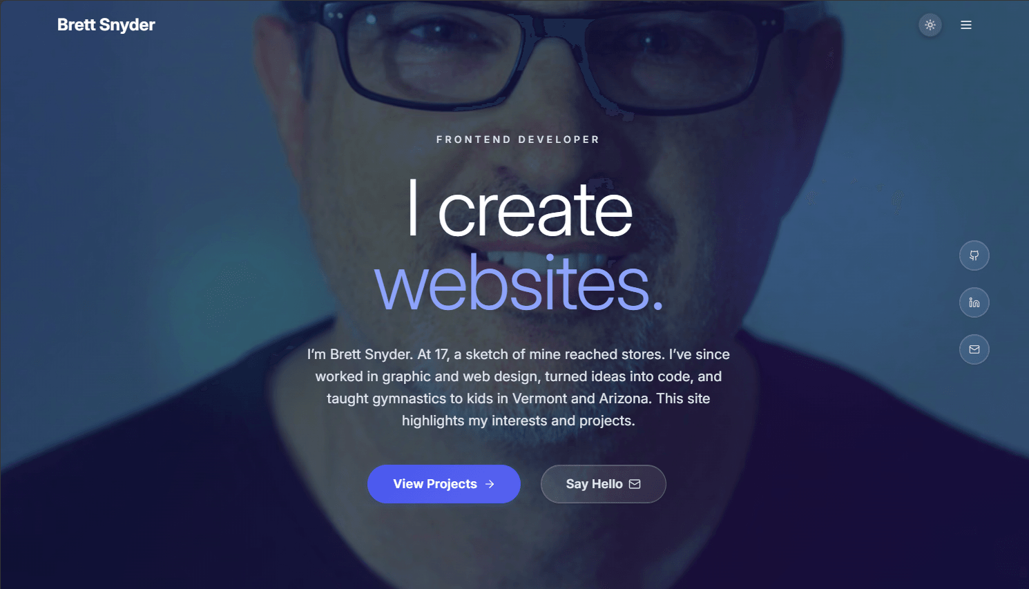
Most portfolios use small circular avatars that lack impact on desktop. I didn't want a large portrait staring at visitors on page load either. My compromise: clean homepage with animated orbs and typography, then a large portrait background that appears only on hover.
Navigation would show just two main hero buttons, moving everything else to a side menu and footer. Since I'm on Vercel's free tier, I added a config toggle to hide resume and commercial elements, which I've since turned back on as the site matured.
Below the hero, I'd keep the successful elements from my old site: latest project cards, recent work timeline, GitHub and LinkedIn links. I planned expanded About and Tools pages, proper blog and project listing pages with thumbnails, and actual project case studies this time. The goal was sharing the same content engine between blogs and projects.
For contact, I stuck with a simple email link—no forms, no bot problems.
Design Approach
I could have started with Figma mockups, but I already knew I was building sections similar to my old site, so I jumped straight into homepage prototyping to test concepts. The dark iridescent effect using feathered orbs over the hero image gave me exactly the soft color shifting I wanted. The hover portrait felt aggressive at first, but adjusting opacity and easing made it impactful without being overwhelming.
Glass effects were appealing but could easily become cluttered. I added a slow-moving floating background panel to enhance the transparency effect. All hover interactions stayed soft and subtle. I initially tried fully glassy buttons but ended up emphasizing them more for better usability.
The Build
Homepage: Once the design concepts were working, I added navigation and footer components to the layout. The header uses a sticky glass effect. I liked the glass blur there but found it too distracting with content panels, so I mainly used rgba transparency instead. I added placeholder latest project cards and fine-tuned hover effects (the dynamic content would come later). The timeline added some color but was mostly static content mapping.
This is where I hit the challenges of using bleeding-edge Next.js and React. Service worker issues, caching problems, Edge browser bugs, and Tailwind incompatibilities created constant friction. I almost switched back to stable versions, but knowing they'd be deprecated soon, I stuck with it. I ended up removing Tailwind entirely and creating my own utility classes. The framework versions were only weeks old, so bugs weren't surprising. Later I realized Vercel's Edge CDN made my service worker redundant, so I removed it and saw network performance improve.
About Page: I followed the same approach as the homepage but didn't want all the animated orbs, so I built a configurable background component that adapts based on the page. The About page uses one animated orb (top-left) with the rest static. I then updated the homepage to use this same background component.
I added focused stats and achievements—much better than my previous verbose About section. The content was more conversion-oriented with clear takeaways. Glass effects made it more visually interesting than before.
This is also where I finalized the light and dark mode styling. I experimented with several theme variations but settled on the two I liked best. I kept some old test styles in case I want to revisit them later.
Tools: This evolved from my old "Uses" page. Instead of a long scrolling list, I created a 4-tab tile layout. Icons are pulled from a large categorized array, giving me room to expand easily.
Projects and Blogs: This section required the most trial and error with the new frameworks. The markdown approach from my old site didn't work despite trying multiple angles. My challenge: I wanted markdown's editing ease for blogs and projects, but also the fast loading I'd seen in JSON-based sites like Shopify. How could I combine both without exhausting API resources on Vercel's free tier?
The solution came close to what I'd hoped for. To create a project or blog, you add a folder (like
my-cool-project) in the corresponding content directory, add images to that folder, then run an npm script to generate both a markdown file and JSON file in your project folder.You edit only the markdown file. Running the script again updates the JSON file. I use this same script to regenerate any markdown files with timestamps newer than their corresponding JSON files. This gives fast JSON loading with built-in markdown backup if the content gets corrupted.
Originally I wanted everything prebuilt locally (file paths, latest blogs, content) to bypass Vercel build deployment and save resources. But Vercel needed all build files to be static for prebuild deployment, and I was using some dynamic features I did not want to compromise. I didn't like the full-static results, so I let Vercel handle the build and changed the file checking logic to build based on change timestamp comparisons. Deploy times increased but stayed well within free tier limits.
Detail pages use a smart media gallery that detects tall vs. wide formats and skips thumbnail bars for single images. It supports inline images with external link awareness, feature tagging, and optional title overrides.
I also convert markdown to rich HTML within the JSON files. This gives my JSON files basic HTML flexibility when needed. Pure markdown conversion to HTML is slow, and pure JSON is too limiting for styled content. With content redundancy, I get the best of both approaches.
Policy Pages: These are straightforward, no-frills content pages.
Mobile: I used the standard small profile picture approach since text was hard to read otherwise. Everything stacks in typical mobile fashion. I tried to use fluid responsive design and clamp() where I remembered to.
Project Structure
src/
├── app/                    # Next.js App Router pages
│   ├── about/              # About page
│   ├── blog/               # Blog listing & [slug] pages
│   ├── projects/           # Project showcase & [slug] pages
│   └── tools/              # Tools/stack page
├── components/             # Reusable UI components
│   ├── layout/             # Header, Footer, Navigation
│   └── ui/                 # Button, LoadingSpinner, etc.
├── lib/                    # Core utilities
│   ├── generated/          # Auto-generated content manifests
│   ├── types/              # TypeScript definitions
│   ├── blogLoader.ts       # Blog content system
│   └── projectLoader.ts    # Project content system
└── styles/                 # CSS files
Adding New Projects
- Create folder:
src/app/projects/content/your-project/ - Add web-optimized project images to the folder
- Run
npm run generate-project-data - Edit the generated
project.mdfile (ignore the JSON file) - Run
npm run generate-project-dataagain after editing
Results
The portfolio rebuild hit most all technical and design goals. The dark iridescent glassmorphism creates visual impact while working well across devices. The hybrid content management system gives me markdown's editing convenience with JSON's performance benefits, making it practical on Vercel's free tier.
Key achievements: implementing latest Next.js 15 and React 19 within weeks of their release, creating a custom utility system when Tailwind compatibility failed, and building an automated content generation workflow. The hover-activated portrait and animated orb system provides desktop impact without overwhelming mobile users.
I'm still adding to it. New projects, updated content, whatever the site needs next.